Designing Neat Pulse: An Award-Winning User Interface That People Love
Lene Bergersen, Dec 12, 2024
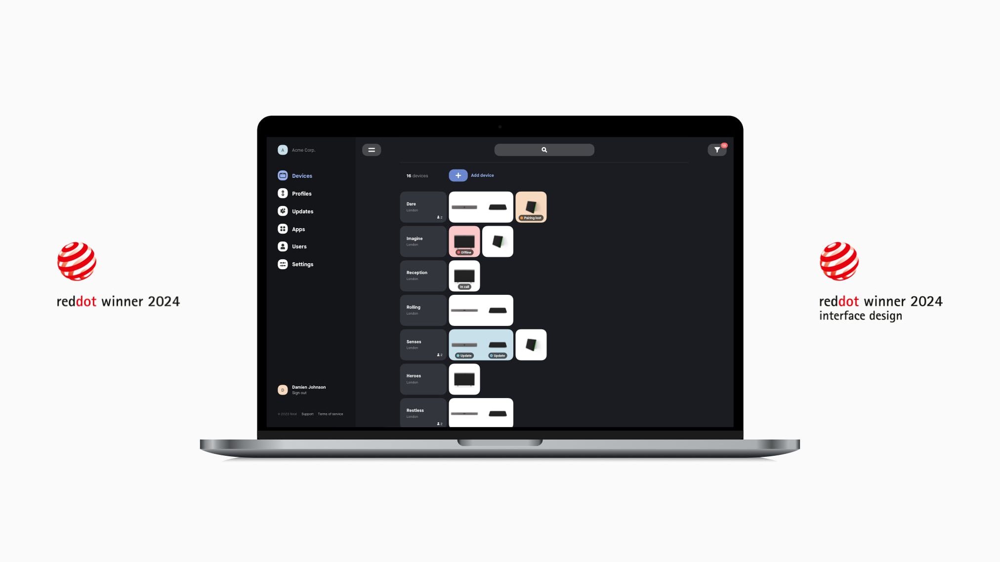
Did you catch our blog announcement titled Neat’s Pioneering Video Devices Win Six Prestigious Red Dot Awards? We’re excited to reveal that we also won a seventh: Neat Pulse won a Red Dot for Interface & User Experience Design, our first in that category, bringing our tally of Red Dots to seven in 2024.
Good design is as little design as possible. Less, but better – because it concentrates on the essential aspects, and the products are not burdened with non-essentials. Back to purity, back to simplicity.
Dieter Rams, renowned German industrial designer
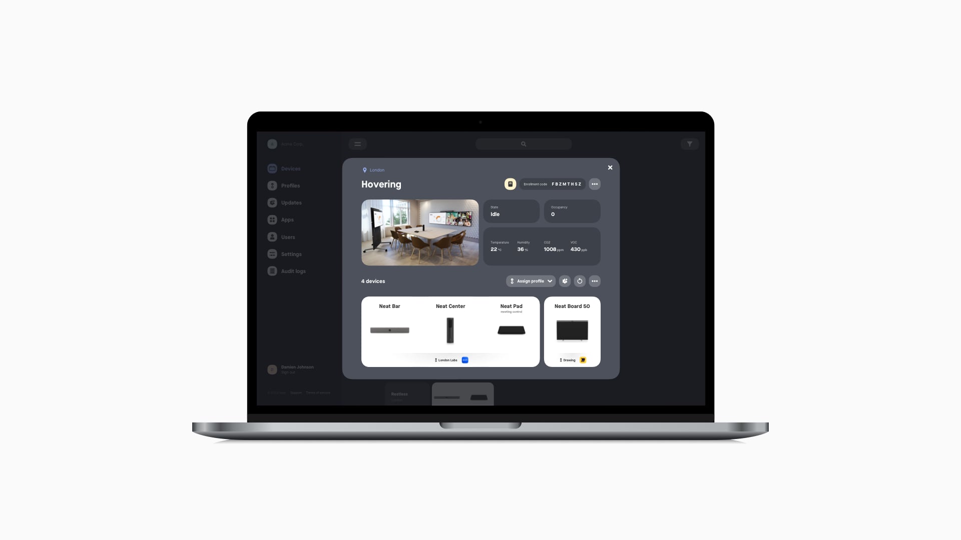
Our Neat Pulse cloud management platform helps your organization deploy and maintain your Neat hardware and software remotely from anywhere. It provides complete control in one beautifully simple yet powerful user interface (UI).
The UI provides an immediate, clear visual overview of your Neat device deployment, crucial status information, efficient filtering, flexible ways to manage multiple devices simultaneously, and information other UIs typically present in lengthy lists and tables. It’s also in dark mode (the background is black, and the text and icons are light, helping reduce eye strain, especially in low-light environments) to convey a feeling of a professional tool and make the Neat devices and device groups stand out.
Neat Pulse is incredibly user-friendly, thanks to its clean and well-organized UI. With over 250 devices in our ecosystem, we need an efficient way to search and manage them, and this does that. The remote access feature is my favorite. It’s like being in the room. It makes it easy to solve problems quickly and efficiently from anywhere worldwide.
Alexander Witte, Senior Specialist, Digital Collaboration & Communication Technology, Spin Master
Creating a smooth customer journey
At Neat, we’ve always strived to make people’s experiences of our products and services the best they can possibly be by removing any friction throughout every step of the customer journey—from buying a Neat product or service to setting it up, using and managing it.
Hence, our mission with Neat Pulse, was to create a simple yet powerful platform where people could control and monitor their Neat devices from anywhere globally regardless of whether they used Zoom or Microsoft Teams as their preferred video conferencing platform. Sounds easy, right?
But as American art director and graphic designer Paul Rand once said, “Design is so simple. That’s why it is so complicated.”
The three most essential problems to solve were the following:
- Before Neat Pulse, there wasn’t a simple place for companies to keep a holistic overview of all their Neat devices.
- Managing Neat devices was high touch. It required IT administrators, AV Support or others to be on site to manage, monitor, or service devices individually.
- How could this cloud-based management solution unlock even more value for our customers? (For example, how could we enable valuable features like third-party applications on Neat devices [Neat App Hub] through Neat Pulse?).
Before, AV Support had no remote management capabilities, control, or access to devices or features. We couldn’t measure what was making our lives easier or harder. But with Neat Pulse, we can easily see and resolve anything. We can leverage valuable information to optimally manage room usage, space booking, and energy consumption, which is a huge win.
Uain Boswell, AV Support Manager, London Business School
Striving for a consumer-grade experience
We knew we wanted Neat Pulse to be turnkey, almost “embarrassingly simple,” automated and reliable. In short, we wanted it to feel like a consumer-grade product that anyone could use, be it IT administrators, AV Support engineers, or any individual in a small company.
From a design perspective, it had to fulfill three main criteria.
- It had to be flexible. It had to provide adaptability for various deployments, meeting the needs of large businesses without making it unnecessarily complex for small businesses.
- It had to be scalable. While starting as an MVP (minimum valuable product), it had to be easily scalable to fulfill future customer needs.
- It had to be simple. Even with multiple layers, it needed to contain only the essential stuff.
Achieving simplicity with flexibility
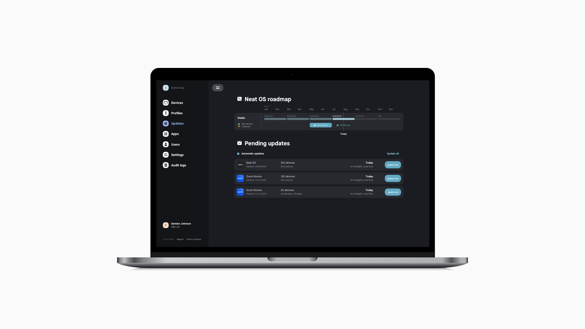
Neat Pulse strips away the non-essential to create simple adaptive functionality based on your organization and your Neat devices’ unique properties. It offers professional tools and clearly and understandably highlights color-coded statuses, actions, and icons. Although keeping the first layer simple, more in-depth details are always just a hover state or click away.
One of the key challenges was eliminating the non-essential information from the main view when the benchmark of similar systems is to display all. Trying to create something flexible yet simple is incredibly tricky. Hence, establishing a simple solution with multiple functionalities to serve many situations often led to many dead ends and non-workable outcomes.
It took an enormous amount of iterations and deep thinking, as well as trying and failing and starting over and over again. However, like Norwegian polar explorer Roald Amundsen and his team, the first Arctic explorers to reach the South Pole, nothing’s quite as rewarding as eventually arriving at that triumphant moment of discovery, knowing you’ve succeeded. Amundsen’s expedition benefited from his careful preparation, robust equipment, and the courage to focus on what was essential to achieve a simple primary task. Likewise with Neat and Neat Pulse!
The Red Dot is the award for high design quality. The international jury of the Red Dot Award: Brands & Communication Design only confers this seal of quality on projects that convince them with their good design quality and creative achievement. In the Interface & User Experience Design category, the award is presented to Neat Pulse.
Red Dot Awards jury
Discover more about Neat Pulse.


